|
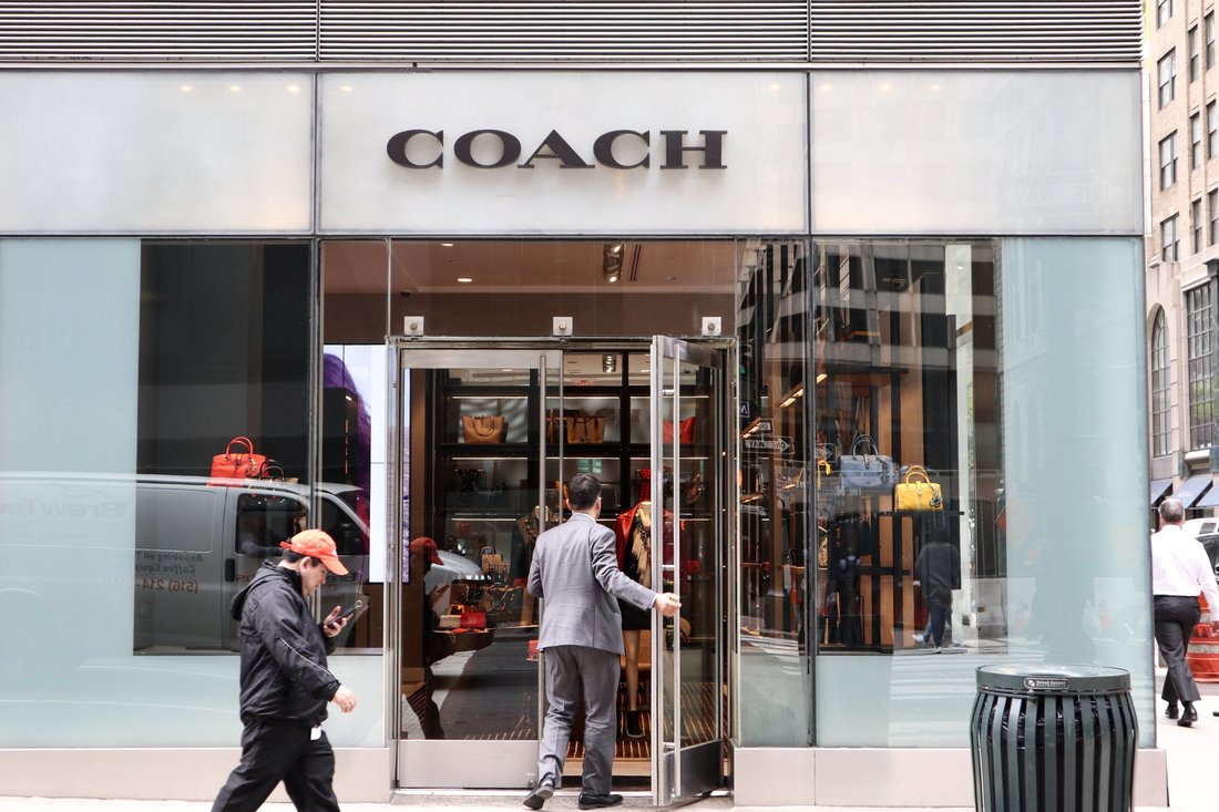
The plan by Coach Inc. to rename itself Tapestry Inc. follows its acquisitions of Stuart Weitzman and Kate Spade. At Coach Inc., which is famous for its leather goods but has become the holding company of an increasingly ambitious fashion group, the name of the game is now … Tapestry. On Wednesday, the accessible-luxury group that owns Coach, Stuart Weitzman and Kate Spade announced its intentions to change the name of its parent to Tapestry Inc., the better to express its new shape as a multibrand entity with a variety of unique properties, as opposed to one dominated by a single brand. “It’s a wonderful metaphor for what we believe in, which is individual threads of different colors all working together to create a picture,” said Victor Luis, the chief executive, waxing a little poetic. Such semantic change has become something of a corporate trend. The Coach Inc. rebranding follows Google’s decision to restructure and name its holding company Alphabet in 2015 and Tribune Publishing Company’s reinvention as Tronc last year. Next up will reportedly be the Weinstein Company, as it attempts to distance itself from its disgraced co-founder, Harvey Weinstein. But in Coach’s case, the change also reflects what has become an escalating race to create the first American Fashion Group — or, as Mr. Luis styles it, “the first New York Fashion Group.” The name change, after all, follows Coach’s 2015 acquisition of the Stuart Weitzman shoe label for up to $574 million and its purchase of Kate Spadefor $2.4 billion in May. And in July, Coach’s rival Michael Kors acquired Jimmy Choo (a brand that Coach was reportedly also considering acquiring) for $1.2 billion. John Idol, the Kors chief executive, told The New York Times that it was “the beginning of a strategy that we have for building a luxury group that really is focused on international fashion brands.”  Tapestry sends a message that “this is a home that is not limited to any category, channel or geography,” said Victor Luis, the chief executive. By rebranding Coach Inc., Mr. Luis is hoping to send a signal to potential targets in the $80 billion global premium fashion market that “this is a home that is not limited to any category, channel or geography.” While Mr. Luis declined to say how many more threads he anticipated adding to his particular tapestry, he did note that one of the requirements for the new name was that it demonstrate inclusivity. “We embrace our differences, whether they be race, gender, sexual orientation or belief systems,” he said. Mr. Luis added that while Tapestry was currently composed of brands based in the United States, he was open to acquisitions in Europe and Asia. To that end, the name was also intended to clarify the differences between not only Tapestry and Kors but also Tapestry and potential European competitors like LVMH Moët Hennessy Louis Vuitton (the owner of brands like Vuitton, Dior, Givenchy and Fendi, and the world’s largest luxury group by sales), Kering (Balenciaga, Yves Saint Laurent and Gucci, among others) and Richemont (Chloé, Alaïa, Cartier and Van Cleef & Arpels). “I’m not here because I’m anyone’s son,” Mr. Luis said by way of example — an apparent veiled swipe at François-Henri Pinault, the chief executive of Kering, whose father, François Pinault, founded that group. Then he said, “We are not a group that believes there is a single country where products have to be designed or manufactured,” a reference to the insistence by European groups on the importance of origin — that there is equity in “made in France” or “made in Italy.” Finally, Mr. Luis said Tapestry would include the results of each of its brands in its annual reports, as opposed to lumping them together into a single entity, as LVMH and Kering do with some of their brands. Still, Tapestry is following in Kering’s steps in at least one way: In 2013, the French group, too, changed its name (it had been PPR), to reflect its transformation from retail and luxury to a luxury and sports lifestyle group. Mr. Luis said he was open to acquisitions in Europe and Asia. That choice involved an invented word (pronounced like “caring”) that refers to the word for “home” in Brittany, France, where Mr. Pinault’s family is from. It was in line with other notable rebrandings like Andersen Consulting’s switch to Accenture (a shortening of “accent on the future”) and Kraft’s move to Mondelez (a combination of “monde” and “deliz”).
Mr. Luis said it was important for Coach to find a name that, unlike those moves, “wasn’t too corporate-y or made up, that was easy for everyone to understand.” The search took two to three months and was conducted by the Carbone Smolan Agency. A list of thousands of names was winnowed to “tens,” which were then tested for legality and cultural associations in the brands’ key global markets. “We were surprised Tapestry was still available,” Mr. Luis said. The one catch: a concern that tapestries could be seen as old-fashioned, and possibly even elitist, associated as they are with European history and palaces. Ultimately, though, the word’s suggestions of craft and handwork outweighed the negatives. Of course, there is at least one other reference associated with “Tapestry.” “For anyone who is aware of the album, Carole King does come up,” Mr. Luis acknowledged, referring to the 1971 record. (He admitted that he had it at home.) “But we discovered most millennials had not heard of it.” Besides, it is not turning “Tapestry” into its theme music. “We will not be playing it in the office,” he said. The name change officially goes into effect Oct. 31. Tapestry will trade on the New York Stock Exchange under the symbol TPR, as opposed to the former COH.
2 Comments
NEW YORK (AP) — To better incorporate all of the brands it now owns, the storied Coach company of New York is changing its name to Tapestry.
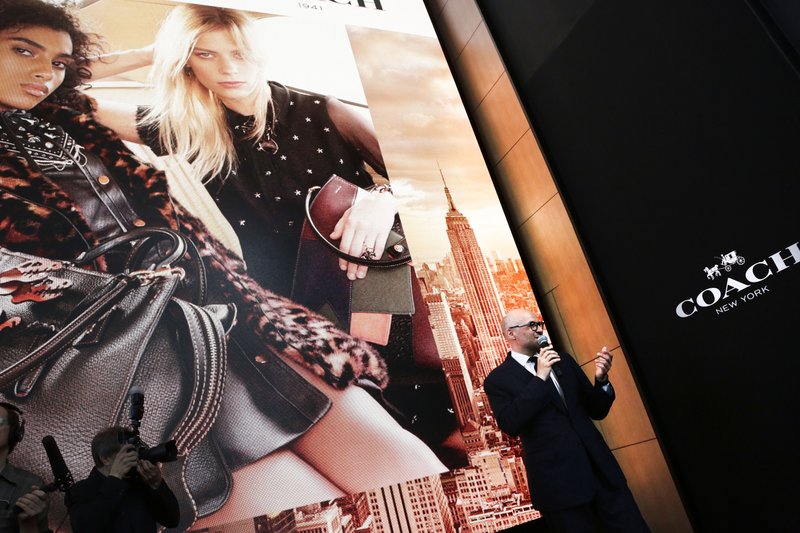
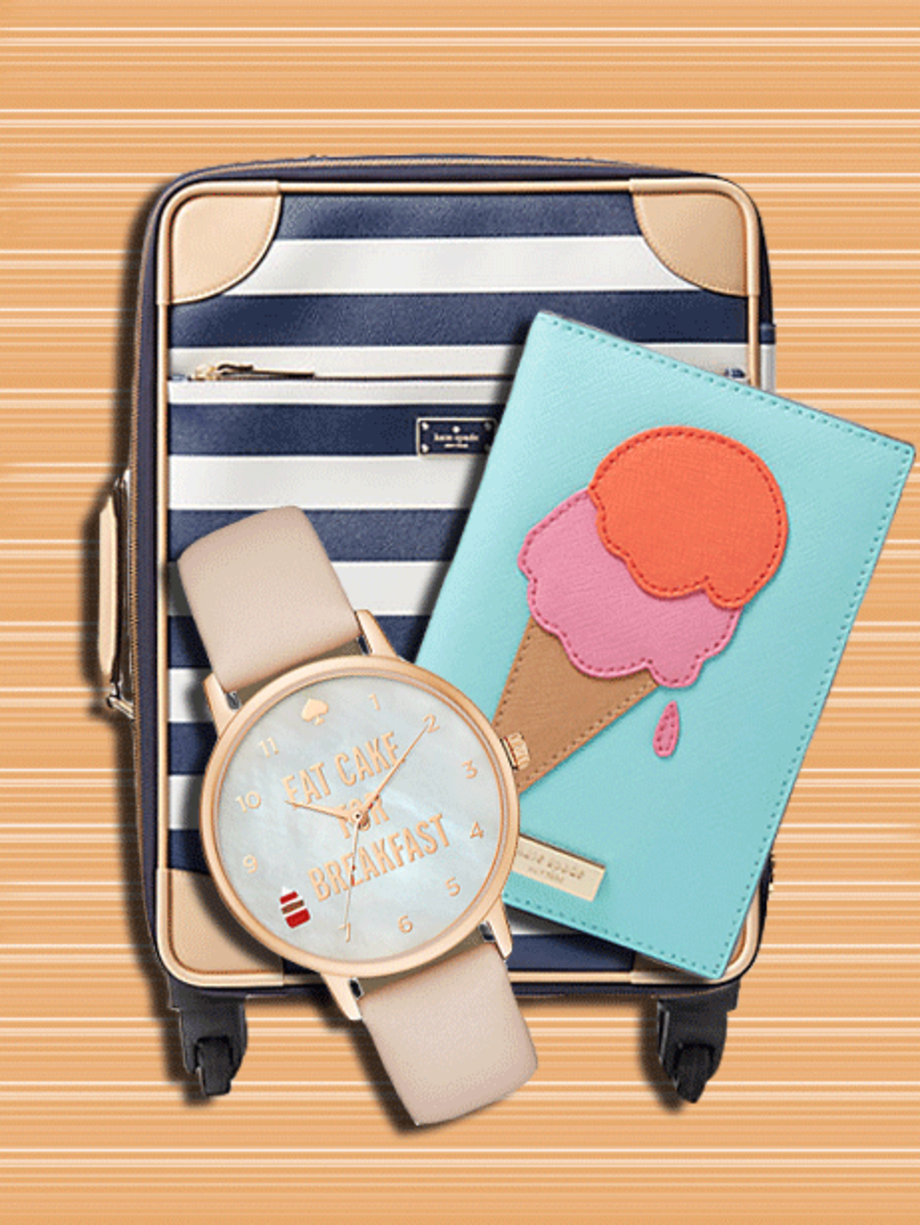
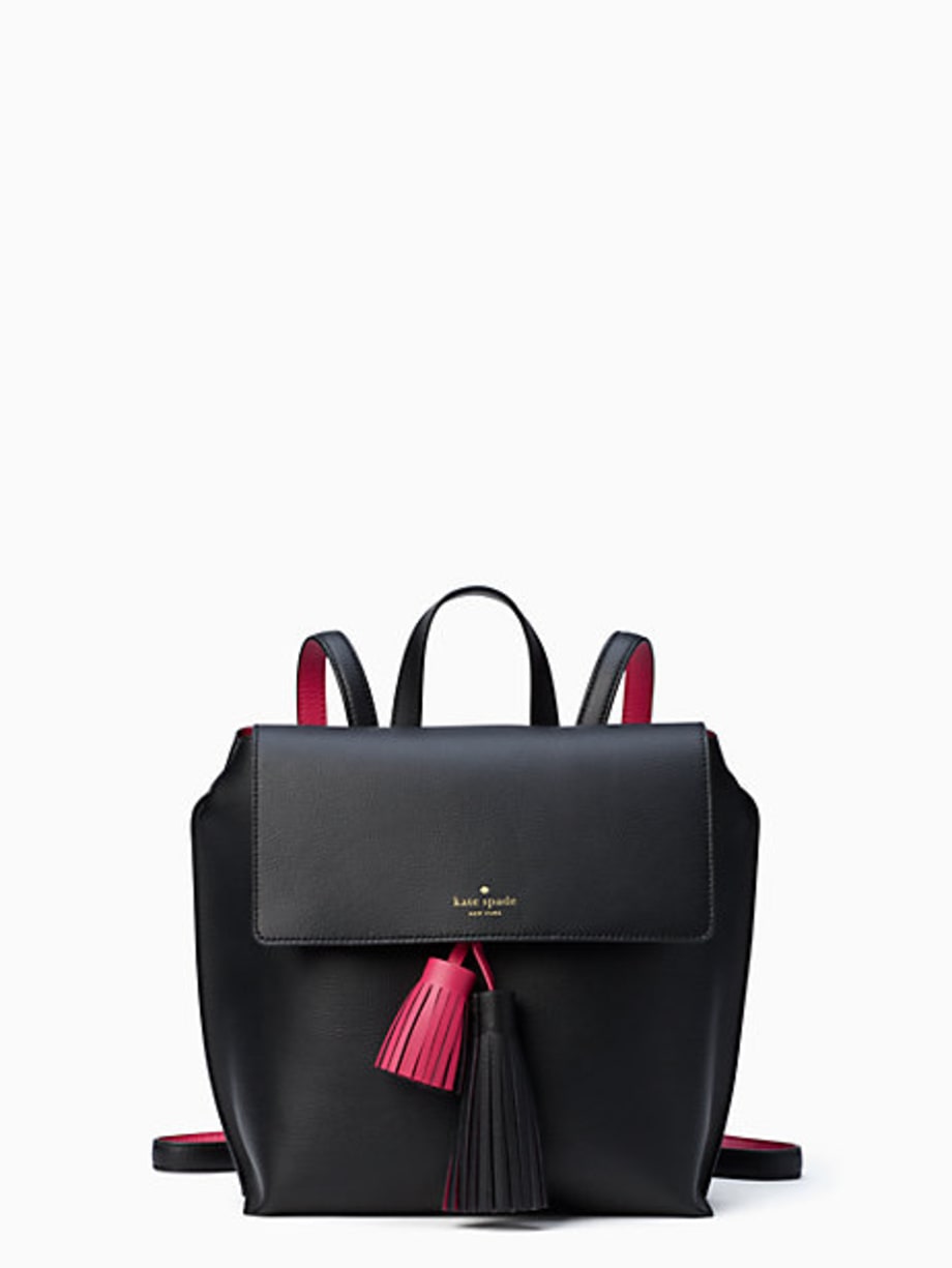
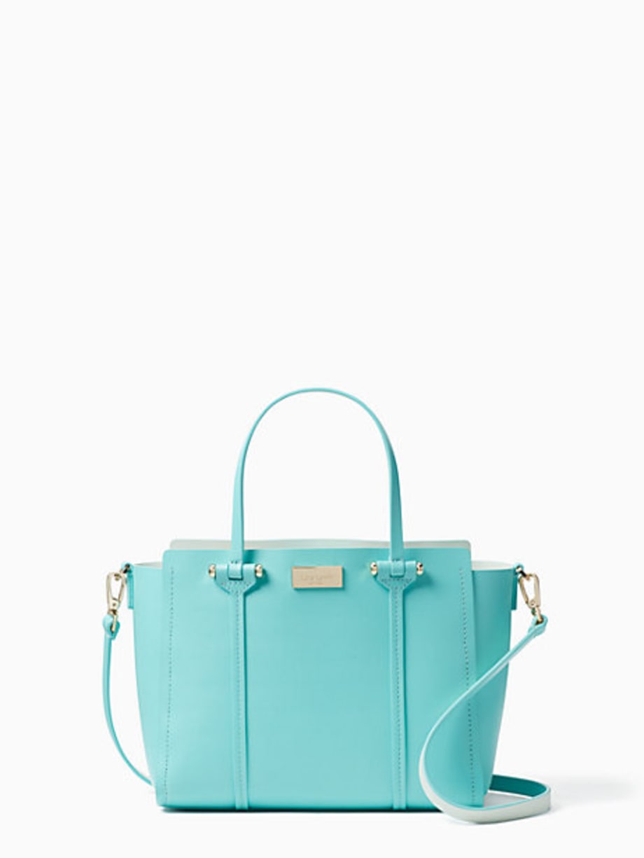
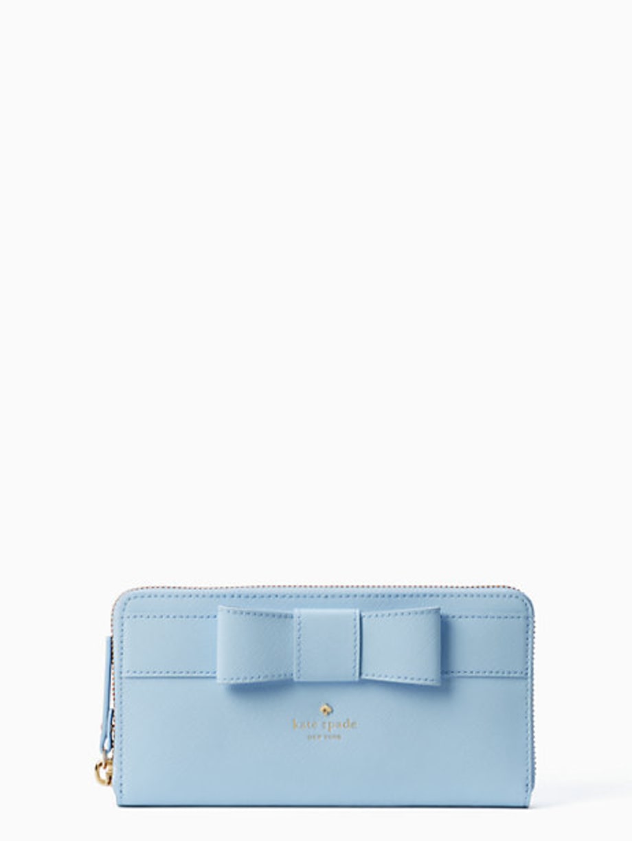
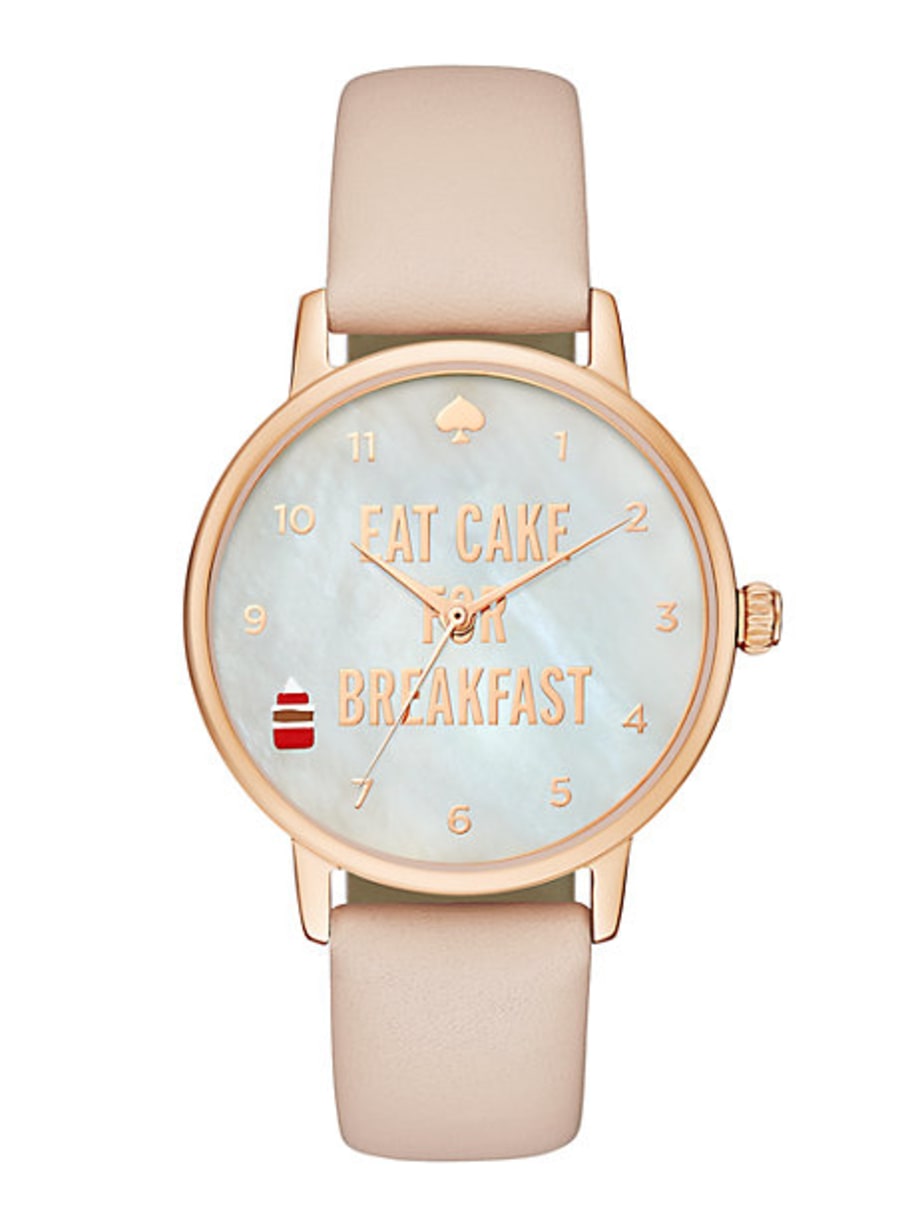
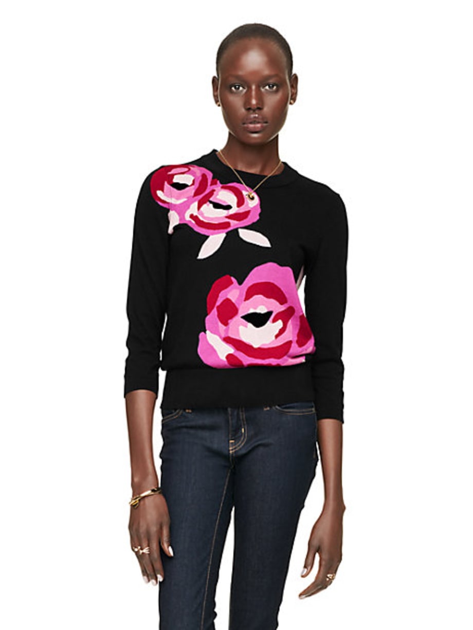
The luxury goods company that came to prominence in the “Mad Men” era now owns brands like Stuart Weitzman and Kate Spade & Co. as well. CEO Victor Luis said Wednesday that the name Tapestry is more inclusive. Coach acquired Stuart Weitzman in 2015 in a deal valued up to $574 million. It spent $2.4 billion for Kate Spade this year, seeking to broaden its appeal. “We are now at a defining moment in our corporate reinvention, having evolved from a mono-brand specialty retailer to a true house of emotional, desirable brands,” Luis said in a company release. A website with the new name, which becomes official at the end of the month, is up and running. The change is part of Coach’s pursuit of younger shoppers who may not feel the same draw to store windows on Manhattan’s 5th Avenue. Coach began as a small workshop in Manhattan in 1941, and became a fashion powerhouse in the early 1960s though innovate designs. Coach Inc. will also be changing its ticker symbol on the New York Stock Exchange from “COH,” to “TPR.” Shares of the company declined more than 2 percent to $39.11 in morning trading ALERT — this is not a drill! Kate Spade New York just launched one of its two-day surprise sales, where everything is up to 75 percent off — and it's all perfect for spring and summer. (Seriously, there's an ice cream cone–shaped wristlet.) Scroll to see Stylish editors' top 13 picks! Kate Spade New York Foster Court Kirk Kate Spade New York Arbour Hill Alston Kate Spade New York Kirk Park Saffiano Lacey Kate Spade New York Eat Cake for Breakfast Metro Watch Kate Spade New York Rose-Colored Glasses Rose Intarsia Sweater
It’s a bag-eat-bag world.
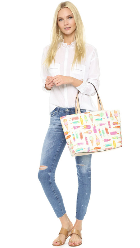
Kate Spade is shopping for a potential buyer after an activist investor prodded the handbag maker, suggesting that another management team could squeeze more growth out of the brand, according to the Wall Street Journal. On Wednesday, Kate Spade shares jumped 23 percent to $17.86 on reports that it was considering a sale. Just six weeks ago, hedge fund Caerus Investors sent a letter to Kate Spade’s board urging it to consider a sale. The fund, which manages roughly $250 million and counts the accessories label as one of its top investments, has been invested in Kate Spade since 2009 when it was owned by Liz Claiborne. Caerus argued that the company would be better off under the control of a global player that could help it expand in the US and abroad. “The board deserved a wake-up call to come to its senses and realize there are other paths to realizing value,” Ward Davis of Caerus told The Post. Since the letter was sent, Davis said that he and his colleague Brian Agnew have had a “constructive dialogue with key members of the board.” “If Kate Spade is truly contemplating a process to explore alternatives or a sale, Caerus would support that,” Davis and Agnew told The Post, declining to confirm any knowledge of the reported deal talks. Reps for Kate Spade did not immediately respond to requests to comment. SEE ALSO Kate Spade lowers 2016 forecast, stock drops 18%Michael Kors and Coach are among the most obvious potential buyers, industry experts say. “Kate Spade is a strong brand that should be larger, and the notion of how to become larger is a fair question,” says Instinet retail analyst Simeon Siegel. Kate Spade has long been a favorite among hedge fund investors. Jana Partners, Citadel, AQR, Balyasny and Point72 each have roughly 1 percent stakes in the company, according to data compiled by Bloomberg. “The product resonates very strongly,” Siegel said, pointing to a Kate Spade collaboration with Everpurse last year on a bag that charges an iPhone. It sold out. Kate Spade’s stock has been choppy, falling 30 percent since July compared with an 8 percent rise in the S&P 500, Wells Fargo analyst Ike Boruchow pointed out in a Wednesday research note. Kate Spade has become pretty well-known for her unusual designs. They typically come in collections inspired by a given theme, where each piece is different but related to that theme. The pieces are playful and unique, sometimes even taking on the shape of the object it is trying to portray. But as much as I love the idea of a clutch shaped like a gnome, sometimes you want your playful piece to be somewhat practical. That is why I like the Kate Spade New York Ice Cream Francis Tote!
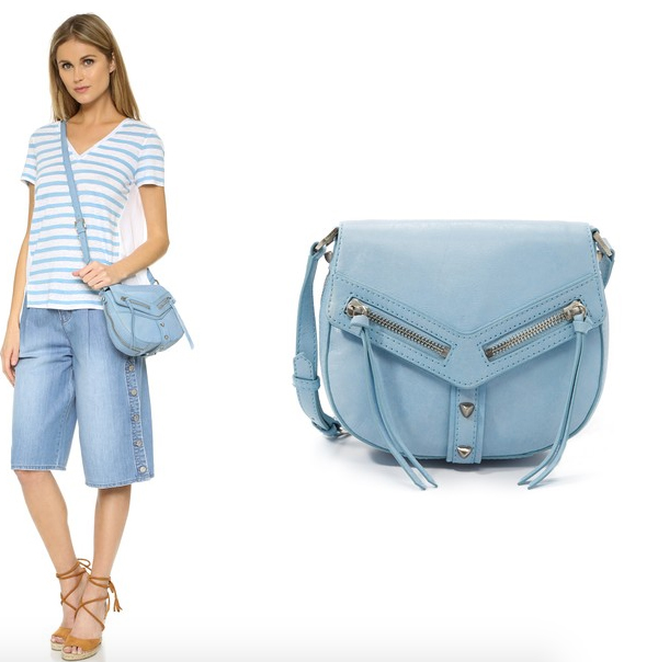
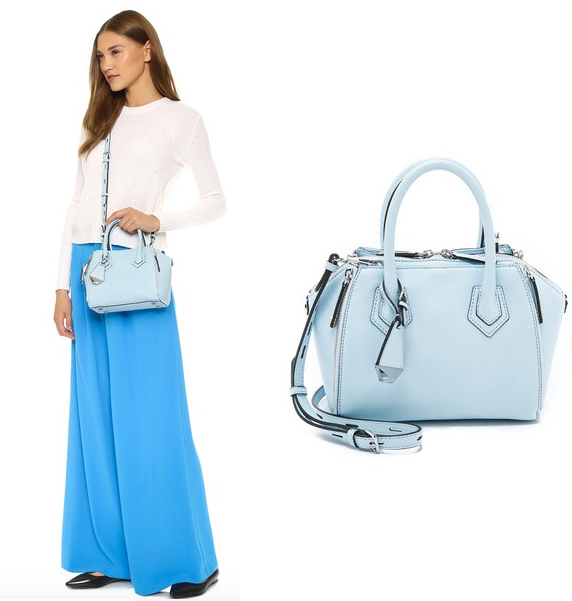
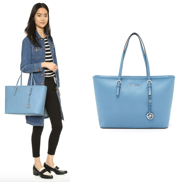
This particular piece is actually part of the Flavor of the Month collection, which depicts what I can only refer to as “old fashioned” fun. The collection features bags that resemble a carousel, a bag of peanuts, a theater or carnival ticket, and an ice cream truck. All of these pieces are clutch-sized and are made to look like these objects. The Francis Tote in this collection, however, is just that… a tote. It has a fun, ice cream and Popsicle print that reminds me a little bit of the prints Dooney and Bourke used to do. I really like the colors and, despite the brightness, I think this piece would be practical for a casual summer day. With spring just around the corner, bring on the colorful handbag trends. I am so excited for spring and even more excited for all of the spring colors. As we learned in my first post in this series (Spring Color Trends: Petal Pinks), Easter egg colored handbags are popping up everywhere and they are a great way to welcome spring. So what’s next? When I think of spring, I think of many things including flowers. However I also think of something that some people may not associate with spring — clear blue skies. There is just something about a spring sky that makes me feel connected with the world around me. It is sort of serene in a way. It makes sense to me then that a light blue handbag would have that same calming effect. In fact, I know it does! That is why I am showcasing some lovely baby blues here. You know, to provide you with a little inspiration. Botkier Trigger Saddle Bag in Sky Botkier is not a designer that I often associate with pastels. But the Trigger Saddle Bag sure does look inviting in this lovely shade of blue! I love the color and the complimenting silver tone hardware. The saddle-shaped Botkier shoulder bag in glazed leather with polished studs. Long pulls hang from the magnetic front flap, and a slim pocket outfits the back. Wraparound zip at the gusset. Lined, 2-pocket interior. Adjustable shoulder strap. $248 Rebecca Minkoff Micro Perry Satchel in Bleached Blue Rebecca Minkoff does many colors well. Pastels though, have always been one of my favorites. They always look good on Rebecca Minkoff styles though and light blue is no exception. Zips adjust the volume of this scaled-down Rebecca Minkoff satchel rendered in pebbled leather. Concealed magnets secure the side pockets, and the top zip opens to a lined, 4-pocket interior. Double handles and optional, adjustable shoulder strap. $325 MICHAEL Michael Kors Jet Set Multifunction Tote in Sky
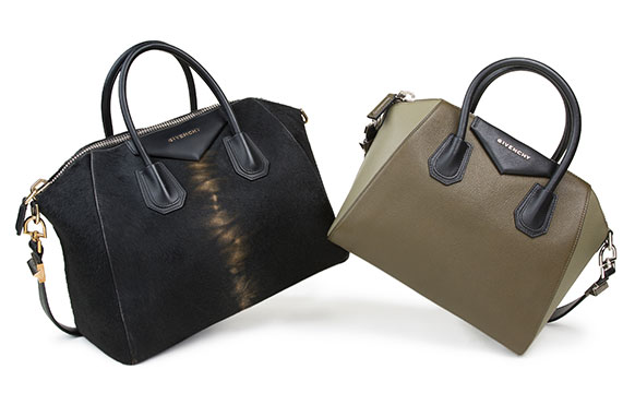
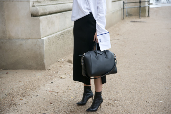
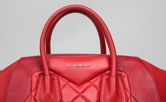
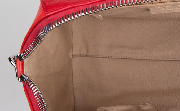
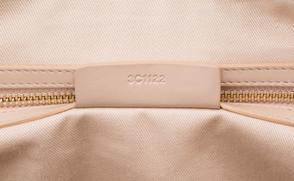
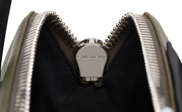
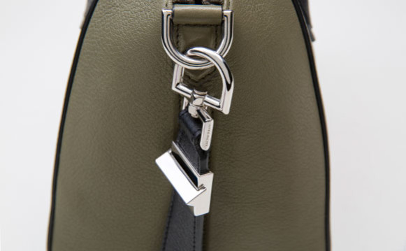
Pastels do not have to come on small handbags. They look great on larger styles too, especially baby blue. It is such a versatile color, it works with more conspicuous styles like this tote. A large, versatile MICHAEL Michael Kors tote in saffiano leather. The top zip opens to a logo-lined interior with 6 pockets and a middle zip compartment. Adjustable handles. $208 Riccardo Tisci’s Givenchy is all about the combination of high fashion, street style and gothic romanticism. Since he took over as Creative Director in 2005 he’s transformed the label in his image, garnered a coterie of famous friends and turned out collections filled with must-have items. Case in point: the Antigona handbag. “Launched in 2011, Riccardo Tisci designed this duffle to mimic the Givenchy aesthetic: clean design with strong lines and geometric ornamentation,” says Senior Director of Authentication Graham Wetzbarger. “Knowing his customers’ lifestyle, Tisci designed this bag to be extremely functional and durable.” Sleek but roomy enough in its larger sizes to fit all of your essentials, the Antigona is coveted by street style stars and celebrities. Often seen on the arms of Rosie Huntington-Whiteley, Kate Moss, Olivia Palermo and most Kardashians, it’s something of an It bag equalizer — edgy but very pulled together. It comes in three sizes — Mini, Small and Medium — and is available in a long list of colorways, prints, exotic skins and more, so while the design is iconic, you can choose a version that fits your personal style. As is often the case with highly sought-after handbags, fake versions abound, so it’s important to know the signs of an authentic Antigona. Here, Wetzbarger breaks down the telltale signs of the real thing. 1. Givenchy Antigona Materials & Construction “Givenchy uses various leathers from polished cowhide to goat, but it should always be sturdy and structured, which keeps the bag from losing its shape,” says Wetzbarger. “While rigid, it should still have a smooth, luxurious hand, and appear supple rather than plasticy. The triangular leather logo detail is padded with batting so it should be convex and puffy, not flat. It should also be firmly affixed without any gaps. Each letter should be separate in the Givenchy logo and very tightly affized to the bag. If you examine closely, you should see that they are very cleanly finished with no rough or raw edges.” On the bottom of the bag, you should find ‘feet’ consisting of two panels created from stacked layers of leather that are glued together and stitched down. “Inspect these carefully,” warns Wetzbarger. “Some fakes will just have stitching in the shape of these panels.” An authentic Antigona is lined with solid cotton twill and should match the color of the leather on other interior details like the label and zipper pocket. “While not fixed to the interior with adhesive, the lining is well-constructed to fit perfectly inside the dimensions of the handbag. It should not be loose or bunchy and should have one center seam across the bottom,” Wetzbarger says. “If you have the original dustbag, it should read ‘Givenchy’ or ‘Givenchy Paris’ on white cotton twill fabric. It should have a crisp screen print with well-defined lines and edges, not bubbles or raised areas of ink.” 2. Givenchy Antigona Brand Stamping & Serial Numbers The date code format used on Givenchy Antigona handbags follows LVMH standards. According to Wetzbarger: “The first two characters denote the location at which the bag was manufactured, and are followed by four numbers; the first and third digits represent the week and the second and fourth represent the year in which the bag was made.” “3C” denotes the workshop location. This Antigona was made in the twelfth week of 2012. He suggests cross referencing your date code with the seasonal specifics of you Antigona. “While some colors like black are made every season,” he says, “certain colorways are season-specific, so you can check to see if particular bags are from the correct year.” In fact, some fake date codes are so wrong that they indicate that the bag was made in a year prior to the Antigona’s debut, or a year in the future. “FW 2011 is the season the Antigona premiered, so your date code should fall between then and now,” notes Wetzbarger. 3. Givenchy Antigona Hardware Handbag aficionados will be familiar with zipper brands such as Riri and Lampo, however the Givenchy Antigona features an oversized zipper made by Raccagni. “Within roughly the past year however, Givenchy has begun using zippers branded with their own logo,” Wetzbarger explains. The geometric shape of the bag is echoed in both the unique pyramid-shaped leather zipper pull and strap hardware; the latter should be emblazoned with the Givenchy logo on one side of the D-Ring. Wetzbarger suggests inspecting the color of the hardware which should be “silver or very light gold in color, but nothing brassy.”
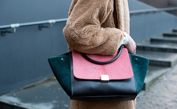
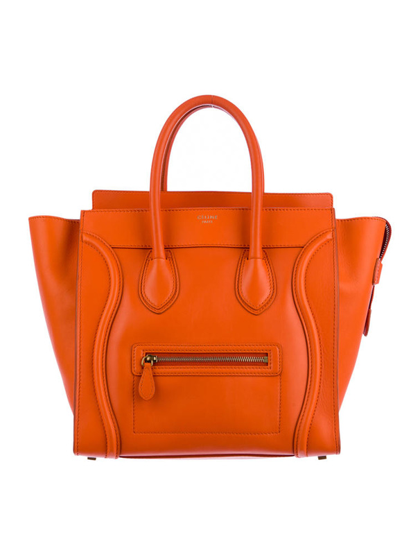
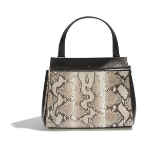
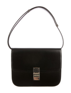
BY JODY HUME Designer Phoebe Philo has a penchant for designing It bags. At the helm of Céline, she’s breathed new life into the once flagging house with designs that have generated waitlists around the world. The first Céline It bag was the Luggage Tote, and was soon followed by other popular designs like the Trapeze, Phantom, Trio, Box and Edge bags. As Philo remarks of the women who are fans of her designs, “They are all different, but with the common thread of an appreciation for clothes that suggest something new but made to last far beyond fast-trend fashion.” While Céline’s bags appeal to lovers of minimalism with their clean lines, sleek colorblocking and lack of obvious logos, they are also instantly recognizable to those in the know. The popular flared gusset designs of Philo’s bags for Céline have spawned lookalikes from both luxury and contemporary brands across the industry, so taking a close and careful look at Céline handbags to ensure their authenticity is important. When inspecting Céline, there are several telltale signs of an item’s authenticity. 1. Heat Stamping On a Mini Luggage Tote, the exterior Céline logo should have an accent aigu, or right-pointing accent, above the first “e,” and “Paris” printed beneath. The font should not look thick and blurry, nor thin and faint. The interior label will have “Made In Italy” printed in caps to the right. Note that on different size totes, the labels will differ. On Nano Luggage Totes, the logo is embossed on a leather tab. 2. Serial Number In most Céline bags, you’ll find a leather serial number tab. The embossed numbers are not unique and can be repeated. They should always follow this format: one letter, two letters, four numbers. Be wary of serial numbers beginning in “S-GA” as counterfeiters often use this prefix. The corners of the rectangular tab are normally clipped at clean right angles. Neither the tab nor the corners should ever be curved. 3. Zipper Unlike many other fashion houses, Céline does not use brand name zippers in their bags. The backs should be plain and unmarked. However, the size of the zipper is often listed on the end, i.e. the number eight. On Luggage Totes, the zippers should have an antiqued finish and should never be brassy or shiny. The D-Rings on the zippers should be large enough to leave space on either side of the leather pull. 4. Lining
Céline always uses high-quality, sturdy leather on their handbags, which lends to their hefty weight. Smooth calfskin Luggage Totes will have matching leather linings. Drummed or pebbled leather bags will be lined in microsuede. The Céline Trio is quite a versatile accessory, as it can be separated into three different bags. If you want, you can even mix and match different colors. Written by TAYLOR BRYANT
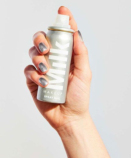
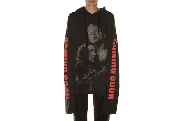
Remember back in November when we reported on Nail Inc.'s new spray-on nail polish and our entire office, along with the rest of the internet, proceeded to lose its freaking mind? Well, we didn't think it was possible, but Milk Makeup is now taking the craze to even wilder extremes with spray-on nail art. Oh, snap. The edgy new makeup brand, launched by Milk Studios, is releasing its own version of spray-can polish, along with a collection of nail stencils to help you create intricate designs, cool ombré effects, and even a French manicure (don't laugh, it's making a serious comeback), all with the aim of a nozzle and the press of a button. The nail design renaissance is showing no signs of slowing down, which is why it makes perfect sense to speed the polishing process up. Milk Makeup is the self-professed friend of the "on-the-go" gal, and nothing says "get out the door" faster than an artsy manicure that you can apply in seconds. We got our hands on a bottle before it hit the market, and are happy to report that it follows Milk's ethos. The pigment applies easily without any streaks or bubbles — something that has plagued even the most meticulous polisher. What's more is that it dries super fast and the excess pigment around your nails washes off easily with soap and water. (Full disclosure: you may need a Q-tip with some nail polish remover to get off some of the color that's super close to your nails.) Fun to use and basically fool-proof? We're sold. The polish, priced at $12, is available for pre-sale today on Urban Outfitters. Until you can get your hands on a bottle, we suggest checking out the video below to tide you over. Written by ERIN CUNNINGHAM We're calling it now: The "Leonardo DiCaprio effect" is officially a thing. On the heels of the 41-year-old actor's first Academy Award win, one item has gone viral and sold out completely — and we're not talking about Trefoils Girl Scout cookies. In September, Vetements (a Kanye West favorite), known for its sartorial rule-breaking, showed a variation of its now-insanely-popular, super-long-sleeved sweatshirt with an image of young Leo and Kate from Titanic screen-printed on it. At the time, a nod to the '97 blockbuster may have seemed random. But, now that DiCaprio is making headlines (and rightfully so), the terry cloth hoodie seems like it hit shelves at just the right time. Despite its $885 price tag, the item has sold out completely across the internet (on sites like SSENSE, MatchesFashion, La Garçonne, Dover Street Market, Antonioli, and Selfridges), and we're thinking his win has a little something to do with it. Though we haven't received official confirmation that this was the reason behind things (we'll update this spot when we do hear back), but we're betting the odds are likely. (Remember: The lengths fangirls will go to knows no bounds.)
If you're a die-hard DiCaprio fan hoping to get your hands on this Demna Gvasalia-designed piece, the slightly cheaper, hooded T-shirt version is still available on SSENSE in every size except large — though we're betting that stock won't be around for long. And for those who cannot. live. without. a sweatshirt emblazoned with Leo's young mug, there are a few overpriced options up for auction on eBay. One bit of advice: Once you get your hands on this inevitable collector's item, never let go. |
AuthorBagity.com for all your Fashion Accessories needs Archives
October 2017
Categories |


 RSS Feed
